Product Owner / Manager


Digital Experience Framework
Bridging design and development through scalable systems, reusable patterns, and shared product thinking. Built to create clarity, consistency, and trust across Banking & FinTech experiences.
Background
I enjoy experimenting across product, UX, systems thinking, and emerging technology, sometimes as side initiatives, sometimes simply out of curiosity to understand how teams can work better together.
Recently, I’ve been exploring areas around Agentic AI, adaptive workflows, and AI-assisted product experiences. I’m still researching and prototyping ideas there, and I’ll be sharing more on this site soon.
One experiment that grew into something much bigger was a token and variable-driven design system initiative for Banking and FinTech products.
It started with a simple frustration: even with modern design tools, teams were still spending too much time manually updating components, fixing inconsistencies, and maintaining separate design and development realities.
So I began exploring how design systems could behave more like scalable infrastructure rather than static UI libraries.
The Evolution
With Figma and component-based design, I began building reusable components. Updating a master component now propagated changes to all instances, improving speed and reliability.However, colors, spacing, and typography were still hard-coded inside components. Updating a brand color remained tedious every component had to be manually adjusted.The solution? Token and variable-driven design.
Token & Variable-Driven Approach
I implemented a three-layered system:
1. Primitives (Raw Values)


2. Semantic Tokens (Contextual Usage)


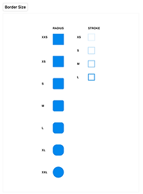
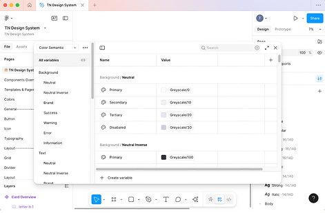
3. Components Linked to Tokens
-
Buttons, cards, forms, and alerts reference semantic tokens.
-
States like hover, active, disabled are also tokenized.
-
Theme switching (light/dark) is effortless by redefining semantic tokens without touching components.


The Result
-
Instant global updates: Change a primary color once, update all components automatically.
-
Seamless theme switching: Light and dark modes applied with zero duplication.
-
Single source of truth: Tokens and variables scale across teams and platforms.
-
Responsive design: Components resize and adapt to any screen or layout.
-
Efficient collaboration: Designers and developers work from the same reference files, reducing handoff errors.
1. Light Mode

1. Dark Mode

This design system enables fast, reliable, and adaptable product design, ideal for the dynamic world of banking and FinTech. Designers can share assets with developers via Figma Tokens Studio or JSON for seamless code integration, and update or iterate with one click propagating changes in colors, spacing, typography, and themes across all instances instantly.
